USA & Global


This is the first branding pass for Karmac, from February 2026. It is not a finished identity system. It is the direction we put on the table: what the brand had to get away from, which shapes we tested against the science, and which mark and wordmark we kept.
Most healthcare identities stop at a pale cross and a sans serif that could belong to any clinic. Karmac is a CAR-monocyte platform, built to eliminate tumor-supporting macrophages. The science is specific. The brand had to be specific in a different way: distinctive, and comfortable at the standard of a large company, rather than a category template.
So the type is humanistic. The name should feel modern and approachable, not stamped out of a medical template. The color is purple — the uniform of care, kept warm — so the brand can hold clinical trust and a sense of something new at the same time.
The mark had to abstract the platform, not illustrate a pathway. We tried three solid geometries.
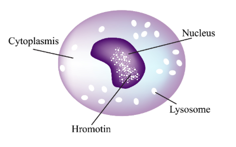
A monocyte's nucleus reads as a bean. A solid U, or a geometric bean, would have been the most direct translation: minimal, and easy to remember. We kept the drawing as a reference. We did not take the shape forward. A logo that still looks like a labeled cell has not finished the job.
Macrophages engulf other cells. The second try was phagocytosis reduced to a gesture: a solid circle with a notch cut from the edge, closer to a refined Pac-Man than to a textbook figure. It reads as elimination, and as action. It also reads as a character. For a therapy brand, that cartoon edge was the reason to leave it behind.
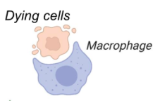
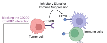
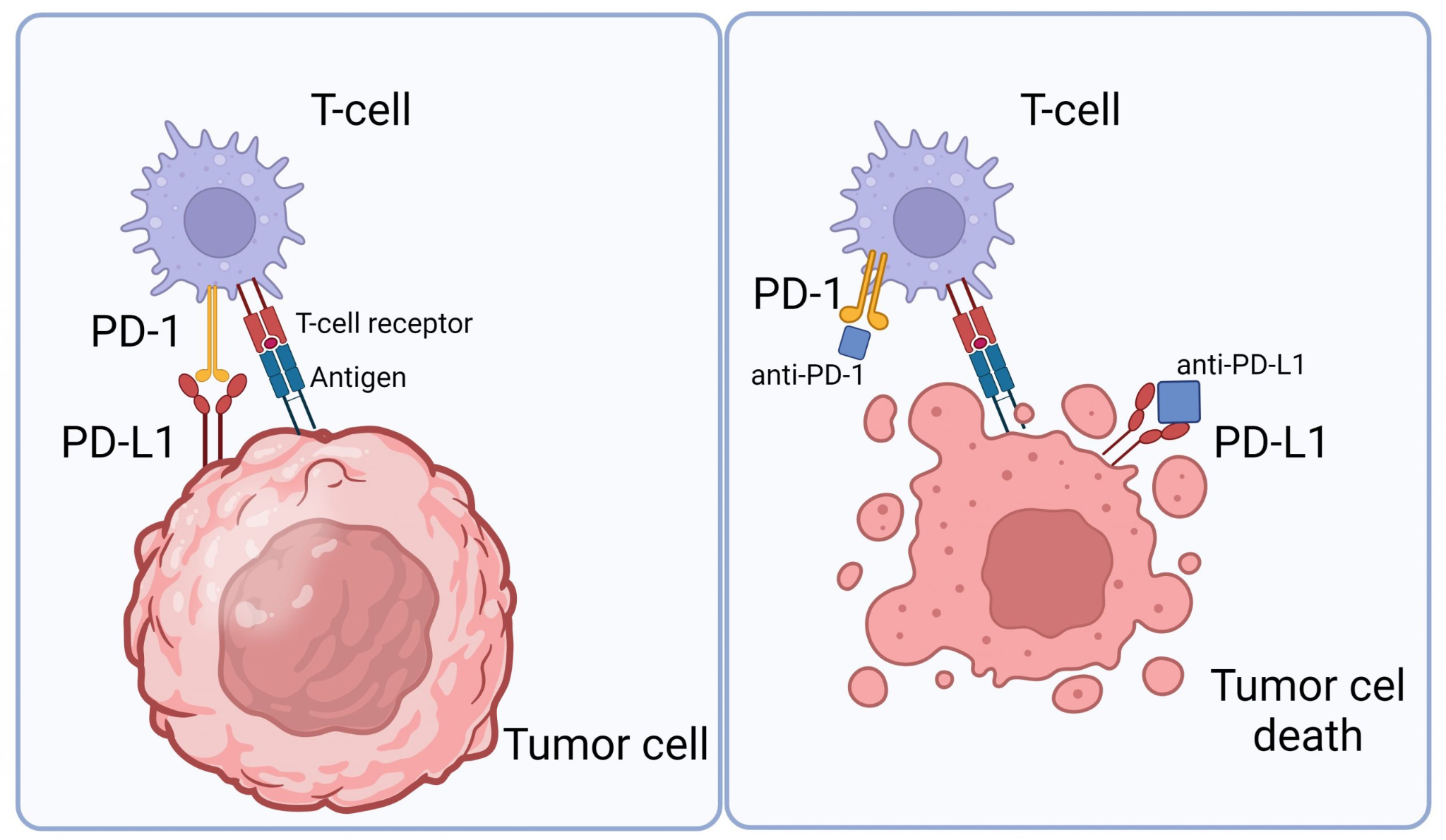
The direction we kept starts from how immune cells are drawn: a round body, and arms that read as receptors. Two references sat on the table while we drew it. One shows the CD200–CD200R interaction, the inhibitory signal between a tumor cell and immune cells. The other shows PD-1 and PD-L1, and the tumor cell once that brake comes off. The mark does not retell either diagram. It takes the silhouette of the immune cell, and leaves the pathway in the science.
The pictorial mark is that cell, drawn as one solid shape. The arms are rounded on purpose. Sharp points would have turned it into a virus, or into something hostile, and the type beside it is meant to feel human. Rounded, it stays scientific and still feels safe.
It is a bold solid, with no hairline detail, so it can shrink to a favicon and still read next to the wordmark on a card. There is a little sunburst in it, a spark. That is the metaphor worth keeping. Karmac's line is unlocking anti-tumor immunity: the immune system being switched on.
The drawing below is still the working vector. The anchor points are left in. This is the shape under construction, not an exported asset.

The name is a humanistic wordmark, and this frame is a construction drawing. The counters are marked. The a is still an outline. That is why it is here: the letters are being drawn, not picked from a font menu and locked.
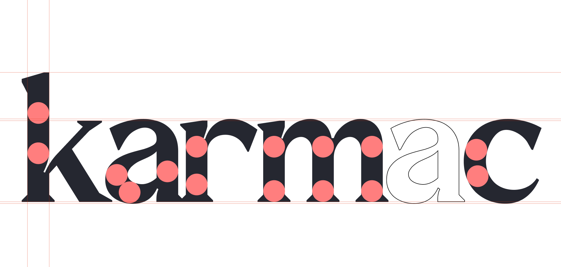
The spark sits at the end of the word, small enough to belong to the c, and large enough to be the symbol on its own when the name is not there.
The palette for this pass is a healthcare purple that does not go cold. Four swatches: a pale lavender, a deep navy for the ink of the wordmark, a warm cream for the field, and a mid purple for the brand color. The cream is doing as much work as the purple. It is what keeps the navy from reading as a lab report.

Two versions of the same idea, plus the name in motion.
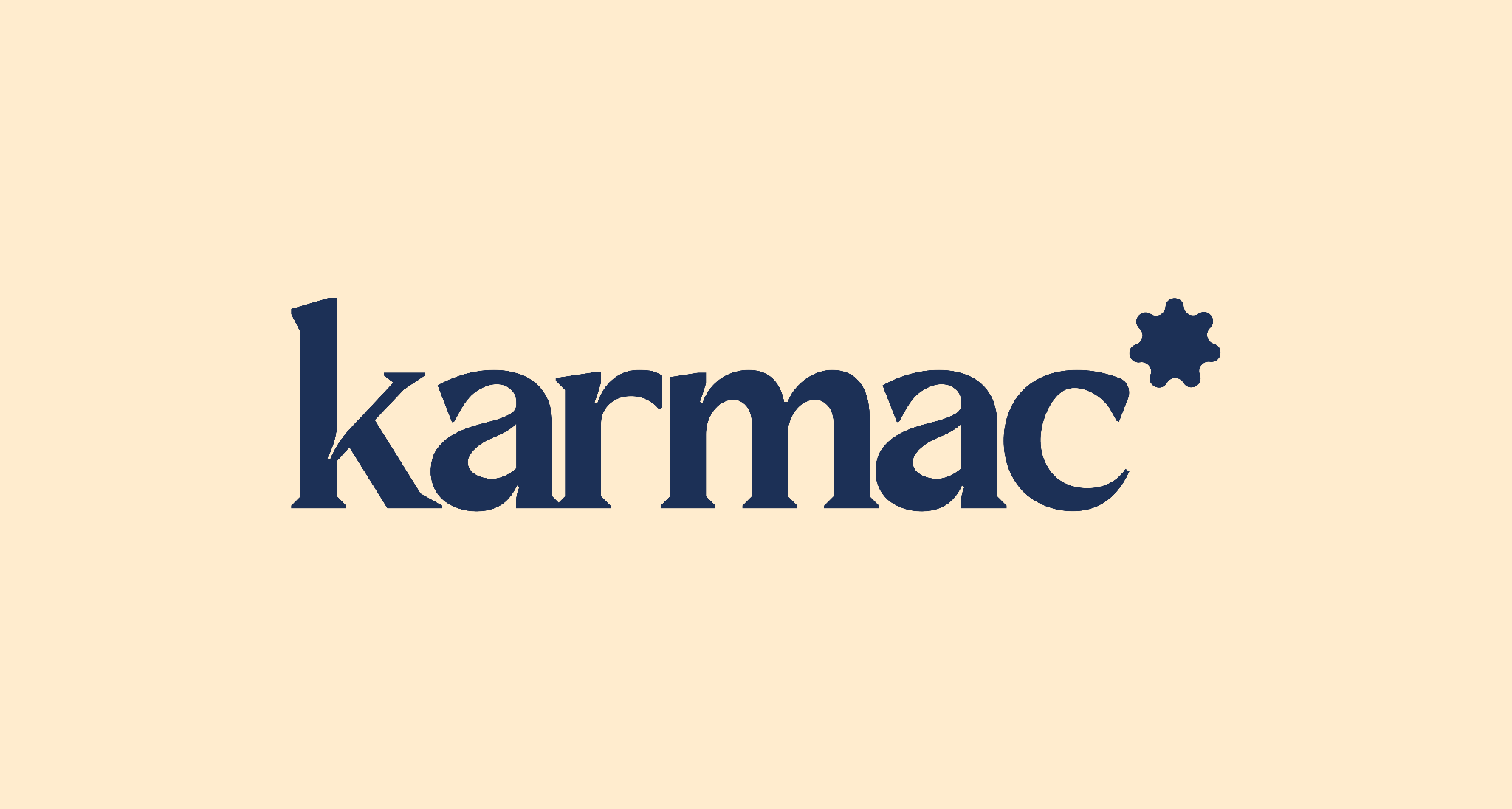
The standard lockup sets the wordmark and the spark on the cream field, in the navy ink.
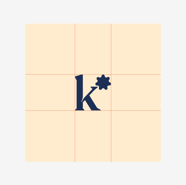
The squared shorthand stacks the K and the spark inside a square, for the places a full wordmark will not fit — an avatar, an app icon, a small stamp. It is still sitting on its layout grid.
The last frame is the wordmark being drawn on, letter by letter. The opening frame is empty. The name arrives.

That is the first iteration. A type specimen, clear-space rules, and a logo file without the anchor points come after the direction is agreed.
Strategy, design, content and growth.